Author:Andy
Released:January 19, 2026
As we move into 2026, the design world is witnessing a dramatic shift away from sterile minimalism toward spaces that feel soulful, curated, and deeply personal. Imagine walking into a room that feels like a velvet-lined jewelry box, warm, mysterious, and undeniably high-end. That is the transformative power of jewel tone interior design.
Why Jewel Tone Interior Design Is The Definitive Trend Of 2026
For years, playing it safe was the golden rule of home decor. But in 2026, homeowners are reclaiming their spaces as sanctuaries of self-expression. Jewel tone interior design is leading this charge because it taps into our psychological need for comfort and richness. These colors, inspired by gemstones like emeralds, sapphires, rubies, and amethysts, offer a depth that creates an immediate sense of home.
Unlike the bright neons of the past or the muted pastels of the last decade, jewel tones are saturated and moody. They work exceptionally well with the maximalist movement, but they also fit perfectly into modern, sleek environments.
According to Pantone color experts, deeply saturated tones are essential for creating environments that foster emotional wellbeing and focus. By choosing a jewel-tone interior, you aren't just following a trend; you are investing in an atmosphere that feels timeless and luxurious.
As we transition from the why to the how, it's important to understand that not all gems are created equal.
Mastering The Palette: Essential Jewel Tone Colours For Every Room
The secret to a successful jewel tone interior lies in the balance. You want the space to feel cozy, not claustrophobic. By understanding the unique personalities of different jewel-tone colours, you can choose the right mood for each room in your house.
Emerald Green: The New Neutral
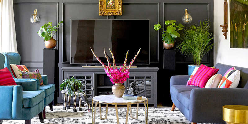
Emerald is perhaps the most versatile of all the jewel tones. Because it is rooted in nature, our eyes perceive it as a restful color despite its high saturation. In a living room, emerald green velvet sofas are a classic choice that pairs beautifully with walnut wood and gold accents.
If you're feeling bold, emerald kitchen cabinetry creates a high-contrast, gourmet look that stands out against white marble countertops.
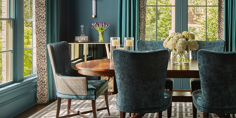
Sapphire Blue: Sophistication And Calm
If you love the idea of dark walls but are afraid the room will feel too heavy, sapphire is your best friend. It provides the depth of black or navy but with a hidden glow that catches the light. Sapphire blue is ideal for home offices or libraries where you want to foster a sense of intelligence and calm. It's a color that looks particularly stunning under layered lighting, such as brass sconces or warm LED strips.
Ruby Red And Garnet: The Energy Boosters
Red can be intimidating, but in its jewel-toned form, think deep burgundy, claret, or ruby, it becomes incredibly sophisticated. These shades are perfect for dining rooms where you want to encourage conversation and appetite. To avoid the haunted mansion vibe, pair ruby tones with modern furniture silhouettes and plenty of natural textures like linen or light oak.
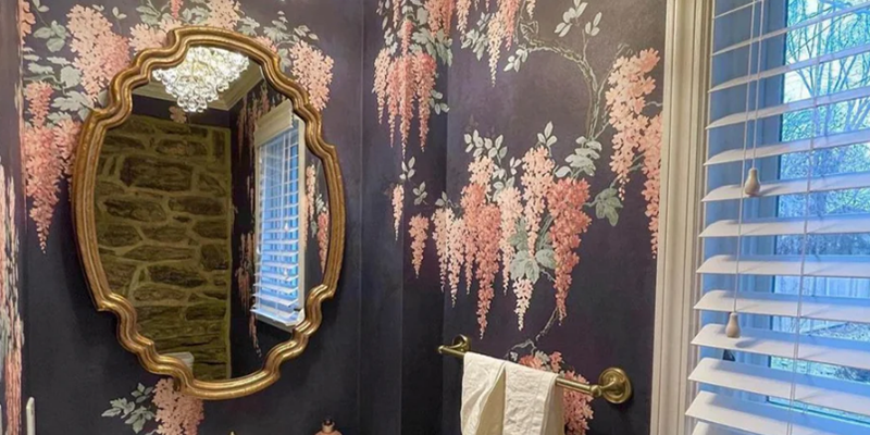
Amethyst And Plum: The Touch Of Royalty
Amethyst is the underdog of the jewel-tone interior design world. It's a regal, mysterious color that works wonders in bedrooms. A plum-colored accent wall behind a headboard creates a focal point that feels intimate and luxurious.
When paired with charcoal greys or soft silvers, amethyst loses its juvenile purple association and becomes a hallmark of high-end design.
Choosing The Right House Paints: From Matte To High-Gloss
The success of your color scheme depends heavily on the quality and finish of your house paint. Jewel tones are pigment-heavy, meaning they react more intensely to light than lighter colors do. This is where many DIYers go wrong, but with a few professional tips, you can get a gallery-quality finish.
The Impact Of Finish On Saturated Colors
- Matte Finish: The gold standard for a modern jewel-tone interior. A matte finish absorbs light, making the color look deep, velvety, and consistent. It's excellent for hiding minor imperfections on your walls.
- Satin or Eggshell: The practical choice for high-traffic areas like hallways and kitchens. It has a slight sheen that makes the jewel tones pop without being distracting.
- High-Gloss: If you want a truly avant-garde look, high-gloss jewel tones on a ceiling or a small powder room wall can look like liquid lacquer. However, be warned: high-gloss shows every single bump and scratch, so your wall prep must be flawless.
Testing Your Light Reflectance Value (LRV)
Before committing to a 5-gallon bucket, check the LRV of the house paints you've chosen. Most jewel tones have a low LRV (usually between 5 and 15), meaning they reflect very little light. If your room has no windows, a low LRV paint will make it feel like a cave.
In these cases, use the 60-30-10 rule: 60% neutral, 30% jewel tone (furniture/rugs), and 10% metallic accents. For high-quality paint options that emphasize deep pigments, brands like Sherwin-Williams offer extensive collections designed for high-saturation coverage.
Furniture And Decor: Layering Textures In A Jewel Tone Interior
A common mistake in jewel tone interior design is stopping at the walls. To make the look feel intentional, you need to carry those rich colors into your furniture and decor. This is where you can play with tonal layering using different shades of the same color family.
The Power Of Velvet And Silk
Jewel tones and luxury fabrics are a match made in heaven. The way velvet catches the light creates natural highlights and shadows that mimic the facets of a gemstone.
A sapphire velvet armchair or ruby silk curtains can add a layer of softness that balances out the intensity of dark-painted walls. If you have a leather sofa, add jewel-toned mohair or faux-fur throw blankets to bridge the gap between rugged and refined.
Metallic Accents: The Jewelry Of The Room
Every jewel needs a setting. In interior design, that setting is your metal finishes.
- Gold and Brass: These are the traditional partners for emerald and sapphire. They add warmth and a vintage luxury feel.
- Silver and Chrome: These pair beautifully with amethyst and cool-toned garnets, offering a more Art Deco or contemporary vibe.
- Black Iron: If you want your jewel-toned interior to feel more industrial or moody academic, use matte-black hardware and light fixtures.
Jewel Tone Strategies For Small Vs. Large Spaces
You don't need a mansion to pull off a bold look. In fact, jewel tones can often make a small space feel more expensive and intentional rather than cramped.
Small Spaces: The Color Drenching Technique
In a small apartment or a powder room, try color drenching. This involves painting the walls, baseboards, and even the ceiling in the same jewel tone.
This blurs the edges of the room, making it feel like an infinite, cozy cocoon. Use a sapphire or emerald to create a dramatic entryway that makes the rest of your home feel bright and airy by comparison.
Large Spaces: Zoning With Rich Hues
In an open-concept home, using jewel-tone colours is a brilliant way to define different zones. For example, you can use a deep teal for the dining area walls to separate it from a neutral living room.
This creates visual interest without the need for physical dividers. Use large-scale area rugs that incorporate your chosen jewel tones to anchor the furniture in these large spaces.
Avoiding The Museum Look: Common Pitfalls And How To Fix Them
The goal of jewel tone interior design is to create a home, not a stage set. To keep your space feeling fresh and modern, avoid these three common mistakes:
- Ignoring the Lighting: Dark colors eat light. If you switch to jewel tones, you must upgrade your lighting. Move away from a single overhead light and toward layered lighting. Use floor lamps, table lamps, and dimmers to create pockets of light that highlight the richness of the walls.
- Over-Matching: You don't need everything to be the same shade of emerald. In fact, it looks better if you mix your greens forest, olive, and emerald. This creates a collected-over-time look that feels much more authentic.
- Forgetting the Breathing Room: Every bold room needs a place for the eye to rest. Incorporate some negative space using white gallery mats for your art, a light-colored rug, or even just a few pieces of pale wood furniture. This prevents the room from feeling like a black hole.
For more technical guidance on how color affects space perception, the U.S. General Services Administration (GSA) provides interesting research on interior acoustics and color psychology that can be applied to home environments to improve comfort.
Your Bold New Chapter Starts Today
Embracing jewel-tone interior design is an act of confidence. It's a move away from the standard and a step toward a home that truly reflects your personality and taste. Whether you start with a single accent wall or go all-in with a velvet-drenched living room, these rich colors will reward you with a space that feels warm, luxurious, and unique.


-
Home Improvements
How to Turn Your Unfinished Basement Into a Luxury Suite for Under $5k
January 5, 2026
-
Home Improvements
Mold Prevention Strategies For Lasting Bathroom Peace
November 22, 2025
-
Home Improvements
Shower Door Replacements For Clear And Inviting Entries
November 20, 2025
-
Home Improvements
Decorative Soap Dispensers For Your Bathroom And Kitchen
November 19, 2025
-
Home Improvements
A Step Toward Relaxation: Converting To a Japanese Ofuro
November 19, 2025
-
Home Improvements
Roll-Out Drawers For Accessible And Aesthetic Essentials
November 19, 2025